
The Paint Colors We Keep Coming Back To
Design: Amber Interiors
There’s something powerful about a perfect paint color—it sets the tone, creates atmosphere, and becomes the backdrop for everything else to shine. At Scarlett Design, we’ve tested hundreds of shades across homes, offices, and boutique spaces, and while trends come and go, these are the colors we return to time and time again. Each one brings a quiet confidence, a sense of calm, and just the right amount of character.
Here are our tried-and-true favorites:
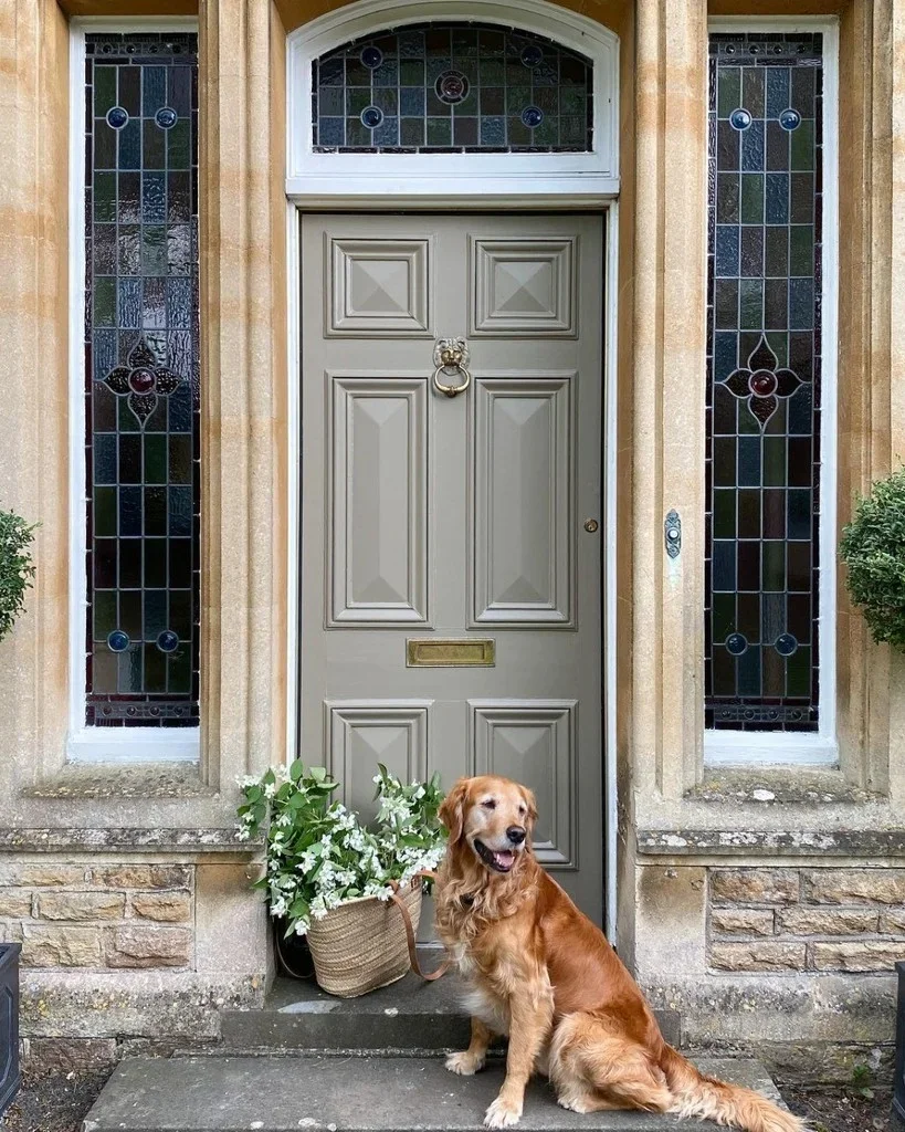
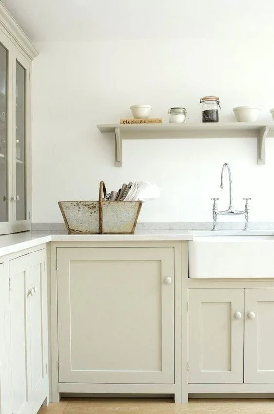
1. Pigeon by Farrow & Ball
Pigeon is the paint equivalent of a well-worn linen shirt—understated, elegant, and effortlessly cool. Its blue-gray undertones shift with the light, creating a space that always feels interesting.
Where we use it: cabinetry, library walls, and layered mudrooms.
Source: Farrow and Ball
Source: Farrow and Ball
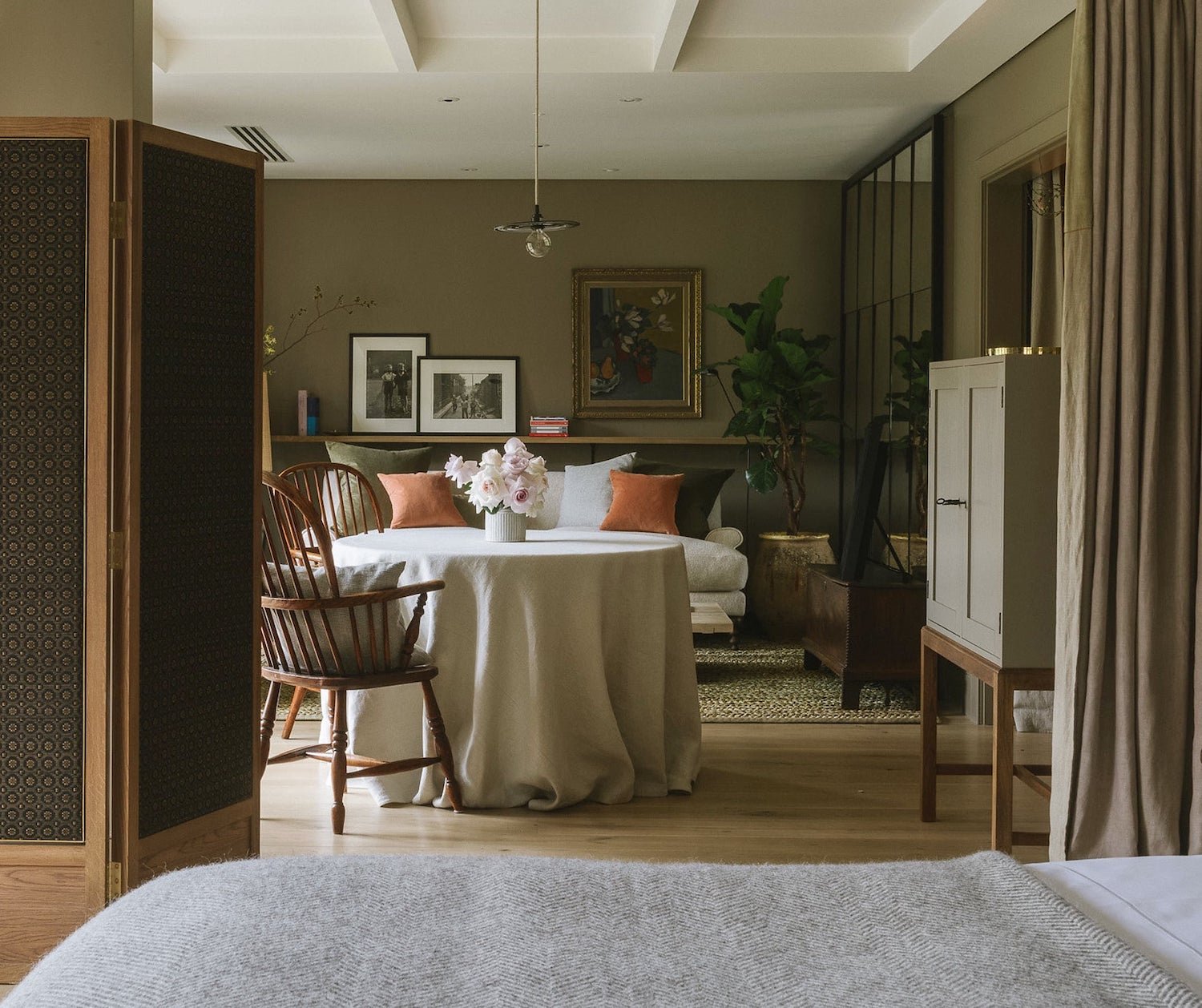
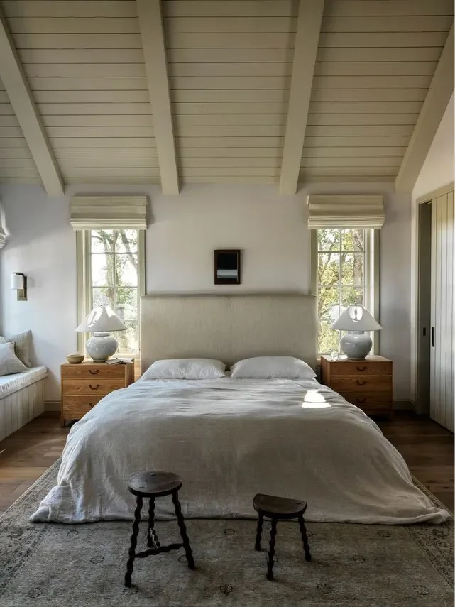
2. French Gray by Farrow & Ball
This muted green-gray has a depth that changes beautifully throughout the day. It brings an old-world richness that feels both sophisticated and grounded.
Where we use it: powder baths, home offices, and moody bedrooms.
Source: REBEKAH AND GENEVIEVE
Source: MEGAN GIEBER
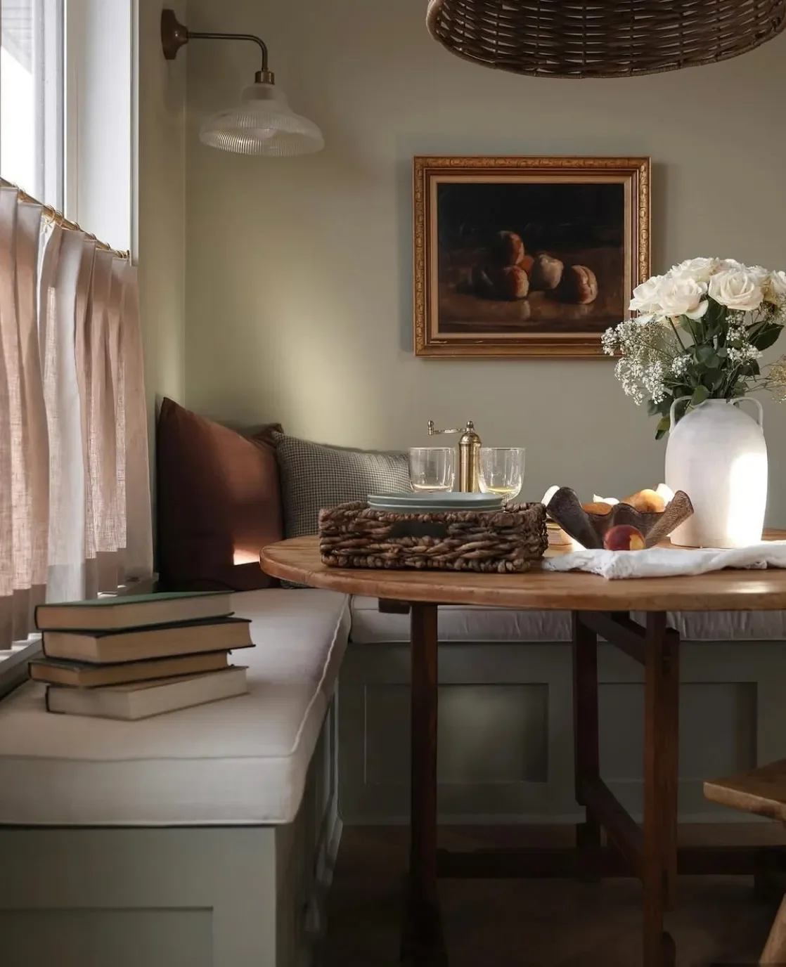
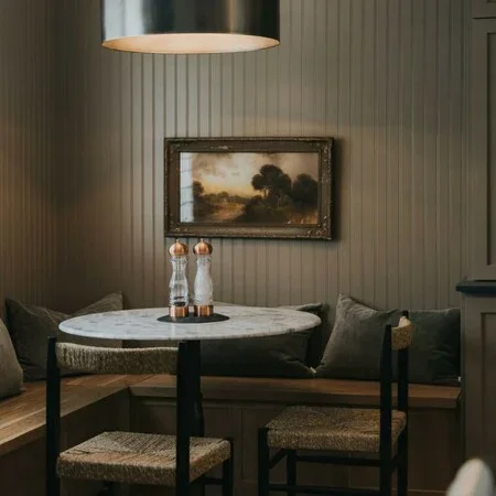
3. Mouse’s Back by Farrow and Ball
Mouse’s Back is one of those magical mid-tone neutrals that manages to feel warm, earthy, and sophisticated all at once. It’s technically a grey-brown, but depending on the light it can read as taupe, mushroom, or even a softened olive. That chameleon quality is one of the main reasons we use it so often — it shifts beautifully throughout the day and works in virtually any room.
SOURCE: LAURA BERN
SOURCE: K&D HOME
SOURCE: FARROW AND BALL
4. Swiss Coffee by Benjamin Moore
Swiss Coffee is our go to white. It strikes the perfect balance between warm and clean — it’s soft and creamy enough to feel inviting, but not yellow or heavy. It works beautifully in a variety of lighting conditions and pairs seamlessly with both warm and cool accents. It’s the kind of white that adds subtle warmth and depth to a room without ever competing with the other finishes or decor — timeless, versatile, and effortless
5. Shaded White by Farrow and Ball
Shaded White has that perfect “not too warm, not too cool” tone that makes it incredibly versatile. It sits right between beige and gray, which gives it a soft, muted character without feeling flat or sterile. What people love most about it is how calming and understated it feels — it adds subtle depth and atmosphere, but still acts like a neutral backdrop for everything else in the room.
Design: Farrow and Ball
Design: farrow and ball